Student Dashboard Design
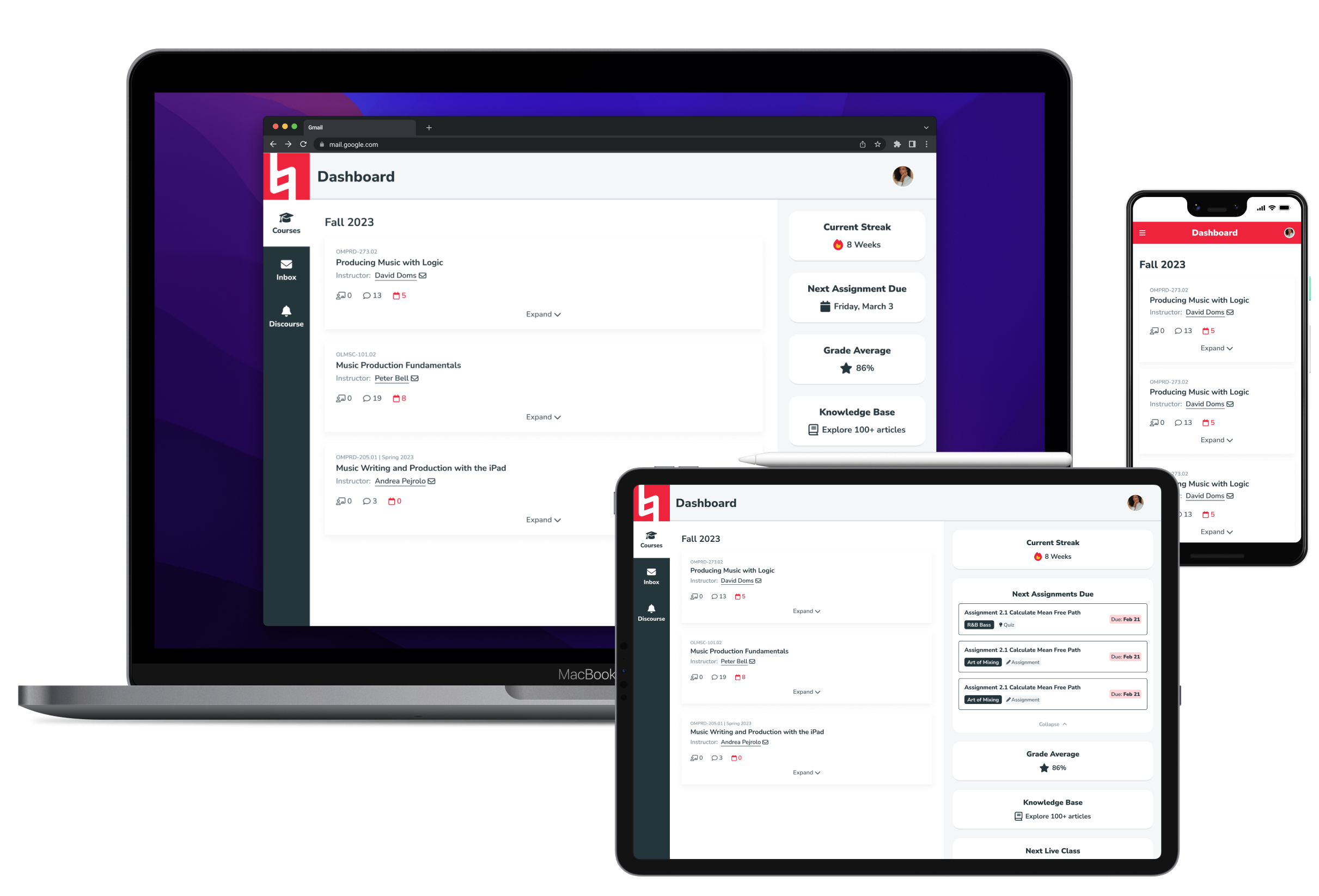
Redesigned learning management system dashboard for Berklee Online students
Timeline
January - March 2024
Deliverables
Designs for dashboard including course navigation, inbox, and widget library + style guide
Impact
Enhanced experience for students with improved navigation, information architecture, and customization options
Categories
UX Design
Visual Design
User Research
Background
One of my first big projects at Berklee started as a small feature request.
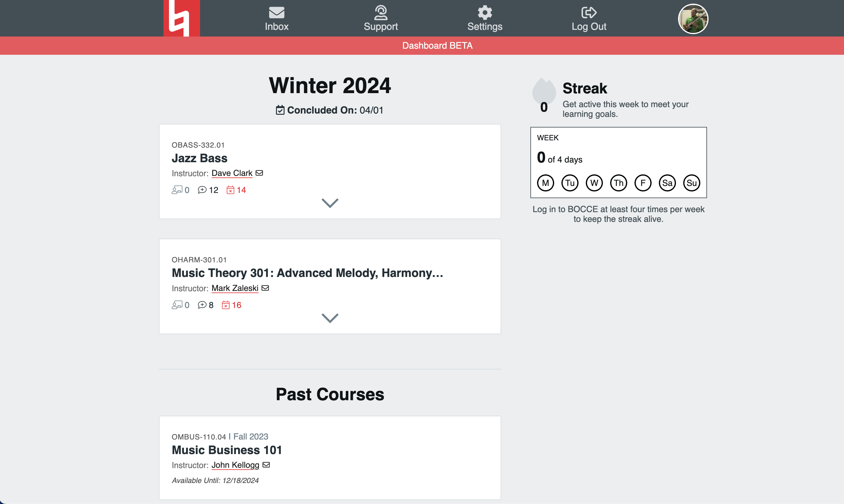
Inspired by Duolingo, a board member wanted to add a “streak” feature to the dashboard keep track of how many consecutive days a student logged into the learning management system (LMS). The dashboard had been added shortly before I joined, mostly as a way for students to navigate between classes, and it was still in beta.
The deadline was tight, so I designed a streak feature and worked with one of our engineers to implement it into the current framework. When a less pressing dashboard feature request came in the next week, though, it was time to rethink the overall layout and structure.
(Image of the original dashboard below)
Requirements
We needed something that would provide the right level of flexibility to accommodate future content but with boundaries that prioritized a student’s experience and didn’t require us to rethink the core layout with every new feature.
I researched the most valuable uses for the dashboard, which included:
- checking grades
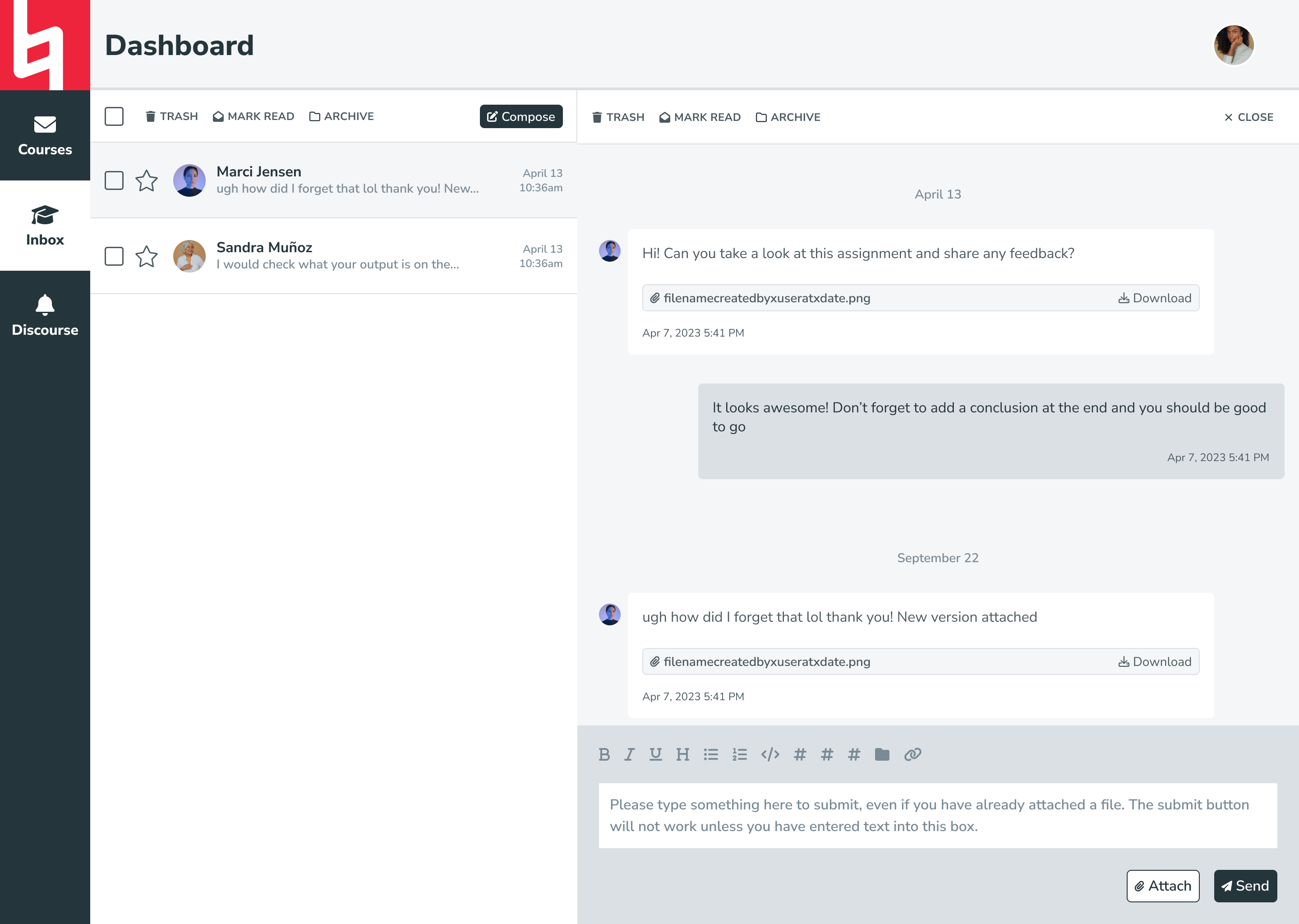
- sending/receiving messages
- navigating between classes
- having quick access to important links
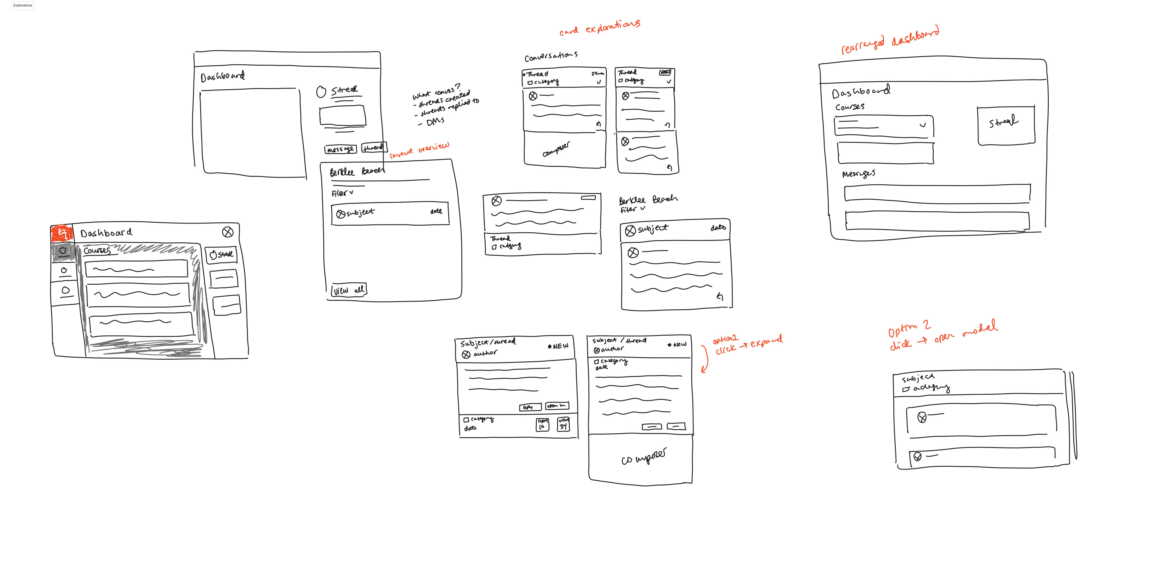
I roughly sketched a few quick ideas to have as a visual reference when I went to our software director to present my case for a major redesign. He agreed with the need for a change and direction I’d proposed, so we kicked off Dashboard 2.0.
Dashboard 2.0
1. Creating a new layout
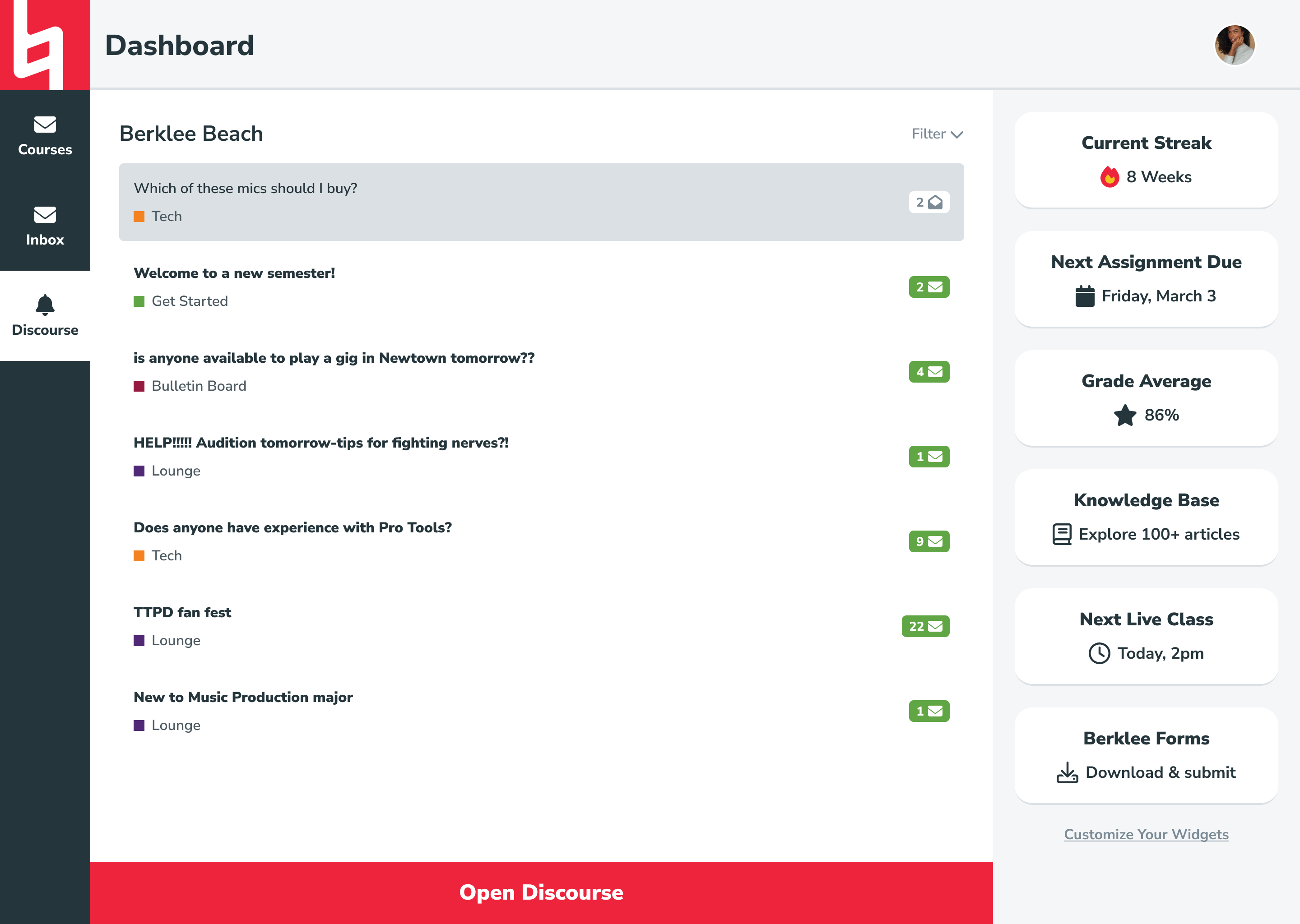
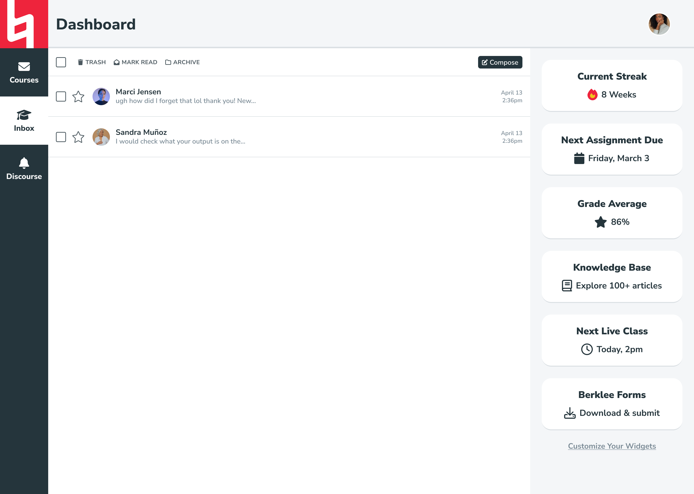
The previous layout wasn’t intuitive and looked a bit dated. The new format better aligns with student expectations (e.g., where the user menu lives and its contents) and makes good use of screen real estate. The sidebar, header, and content window layout also matches what students are used to inside their courses, making it easier to move back-and-forth between the two.
2. Separating primary and secondary content
By dividing the primary (everything in the left pane) and secondary (everything in the right pane) content, we established a natural hierarchy that lets content-rich elements like course cards and messages take up as much space as possible while preventing secondary elements (streak meter, grade average, etc.) from causing a distraction.
3. Adding customizable widget sidebar
We knew that the dashboard would be receiving lot of requests for niche features from leaders across the organization in the future, but we couldn’t predict exactly what they would be. I wanted to come up with a structure that allowed us to fulfill these requests without compromising on student experience. The solution: a widget sidebar.
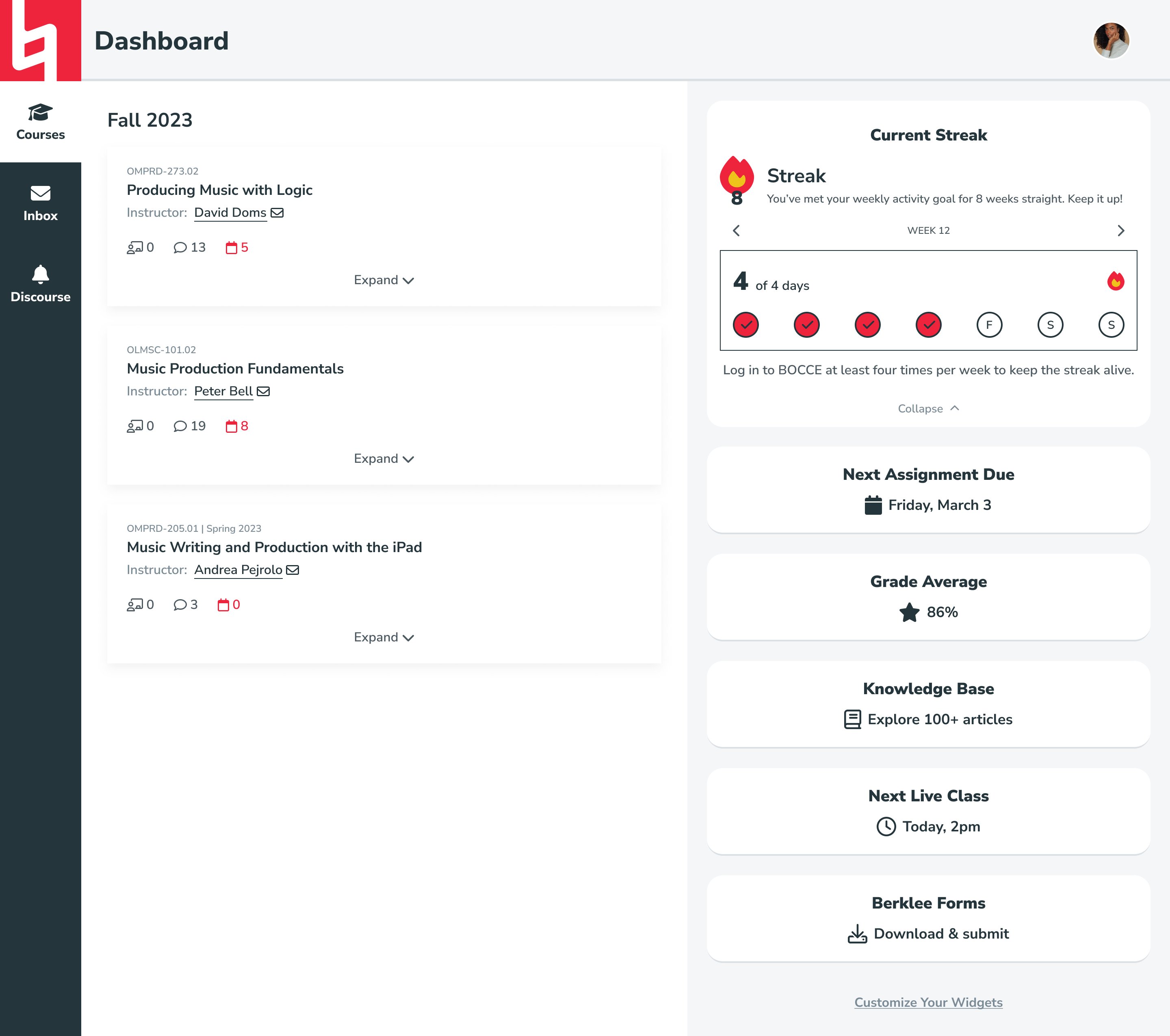
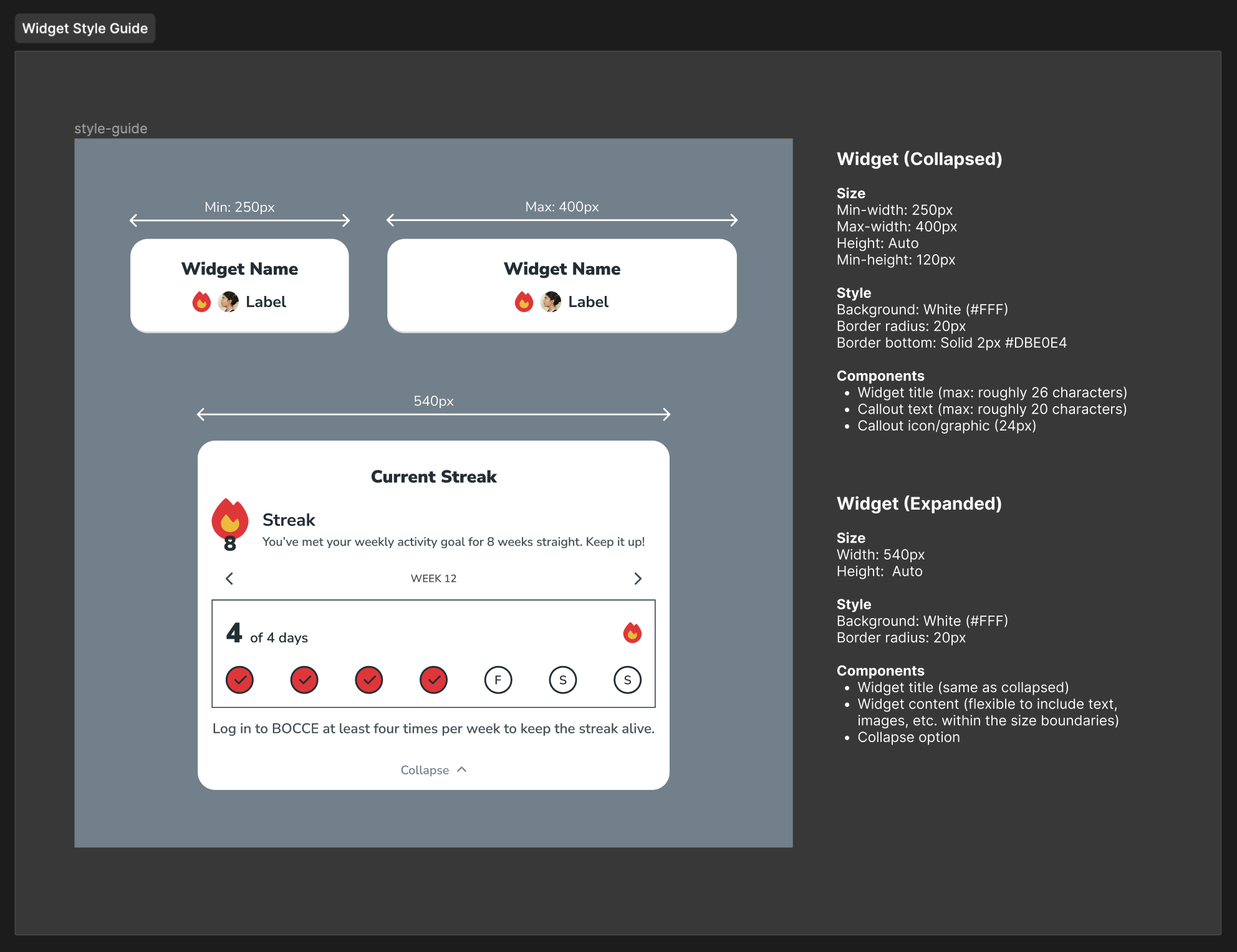
Any future requests could be handled with widgets, small blocks of content that adhere to a consistent style guide (heading, description, and icon). Widgets could either expand to reveal additional detail or simply be used to link to other areas of the website or platform. Most importantly, students could customize which widgets they wanted to see, and in what order, on their own dashboard.
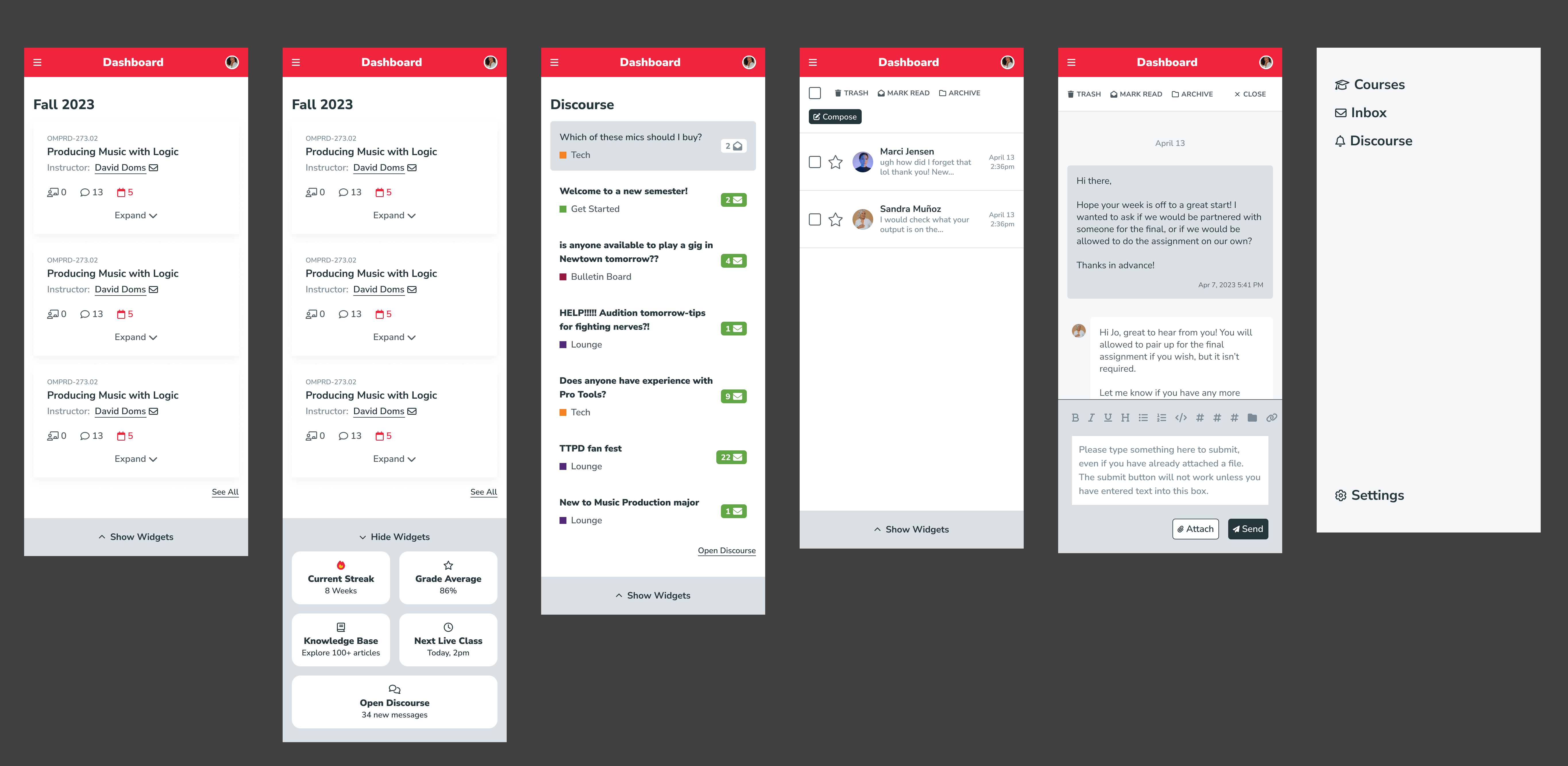
Mobile
By creating a stronger organizational structure, we were also able to drastically improve the experience on mobile devices. Now, students can select the hamburger menu to navigate between the dashboard's primary content areas: courses, inbox, and Discourse. Widgets are collapsed by default on mobile to maximize ease of access for students' most critical tasks, but they can be expanded from the bottom of any screen.
Surveys
As the final step in this process, I created a series of surveys to go live alongside the Dashboard 2.0 implementation. The surveys collect quantitative and qualitative feedback about student experience and will be analyzed in tandem with usage data from Gainsight to track adoption and discover new insights that will be used to iterate on future versions of the dashboard. At the time of writing, the dashboard was currently in development and is planned to launch in late spring 2024.
Ready for more?
Check out additional case studies below!