Lab Author Home Page Redesign
Skillable
Product Design Lead: Kim Oswalt
Engineering Lead: Ron Haberle
Product Managers: Tosha Hawley, Eric Grau
Skillable's redesigned home page makes key workflows faster, easier, and more intuitive.
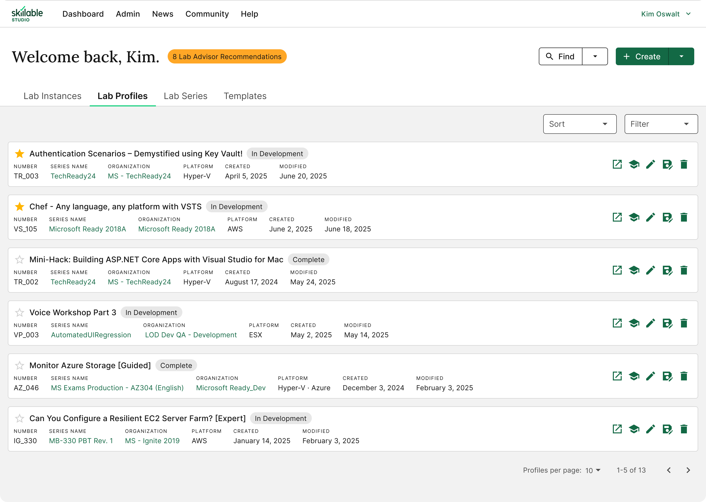
The home page is the first screen lab authors see when they log into Skillable Studio. It's intended to provide easy access to their most important tools and workflows, like creating and editing labs, writing instructions, and monitoring performance.
Background
The original Studio home page added little value. It only supported a few specific workflows, used valuable screen real estate poorly, and wasn't set up to support new features.
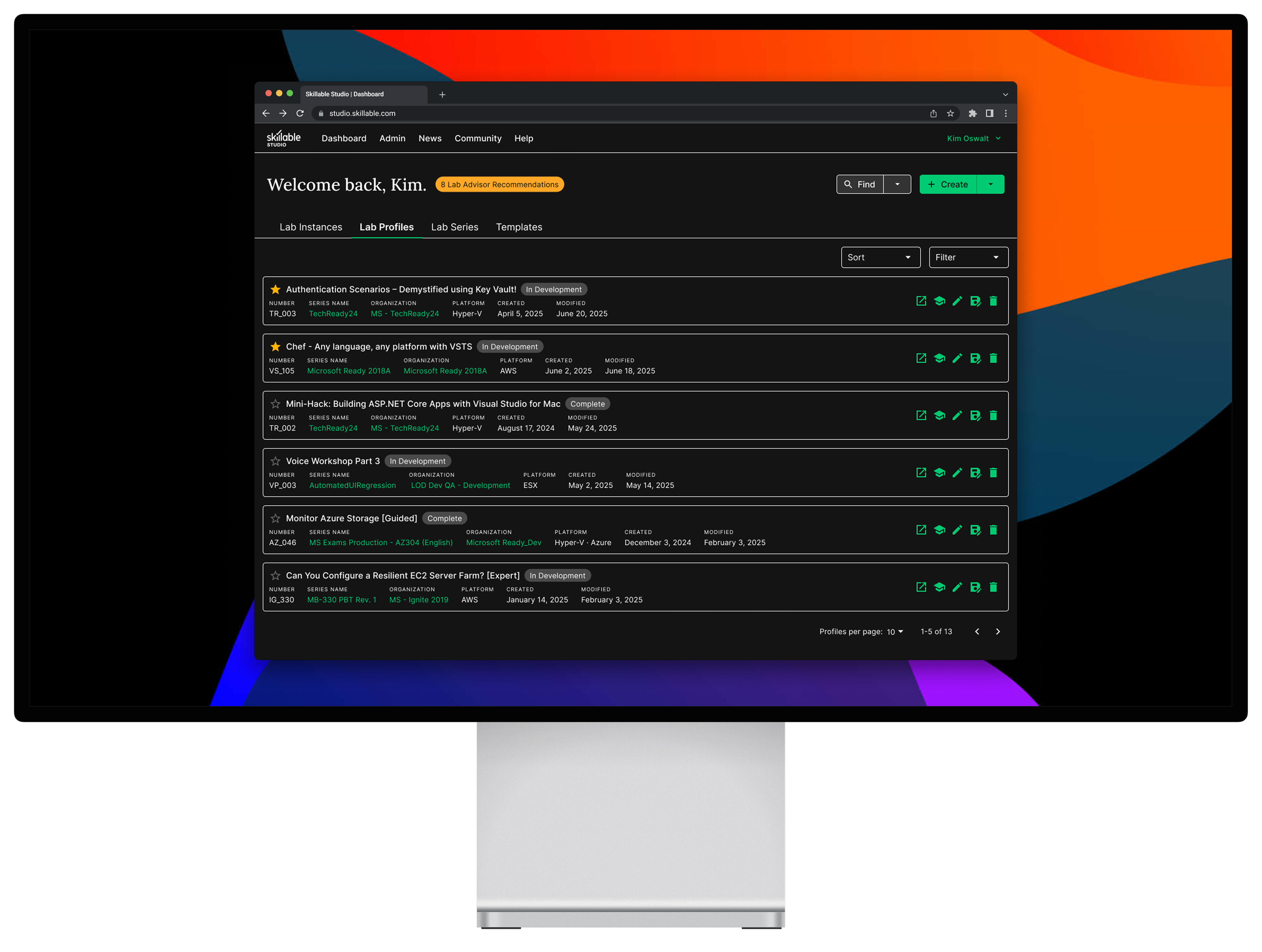
The previous home page design had large, single-purpose buttons, a confusing Lab Advisor sidebar, and limited options for engaging with content from the labs table.
After tagging each element in Pendo, I discovered that the components at the top of the page were the least used. In fact, most features on the home page were underused—with one notable exception.
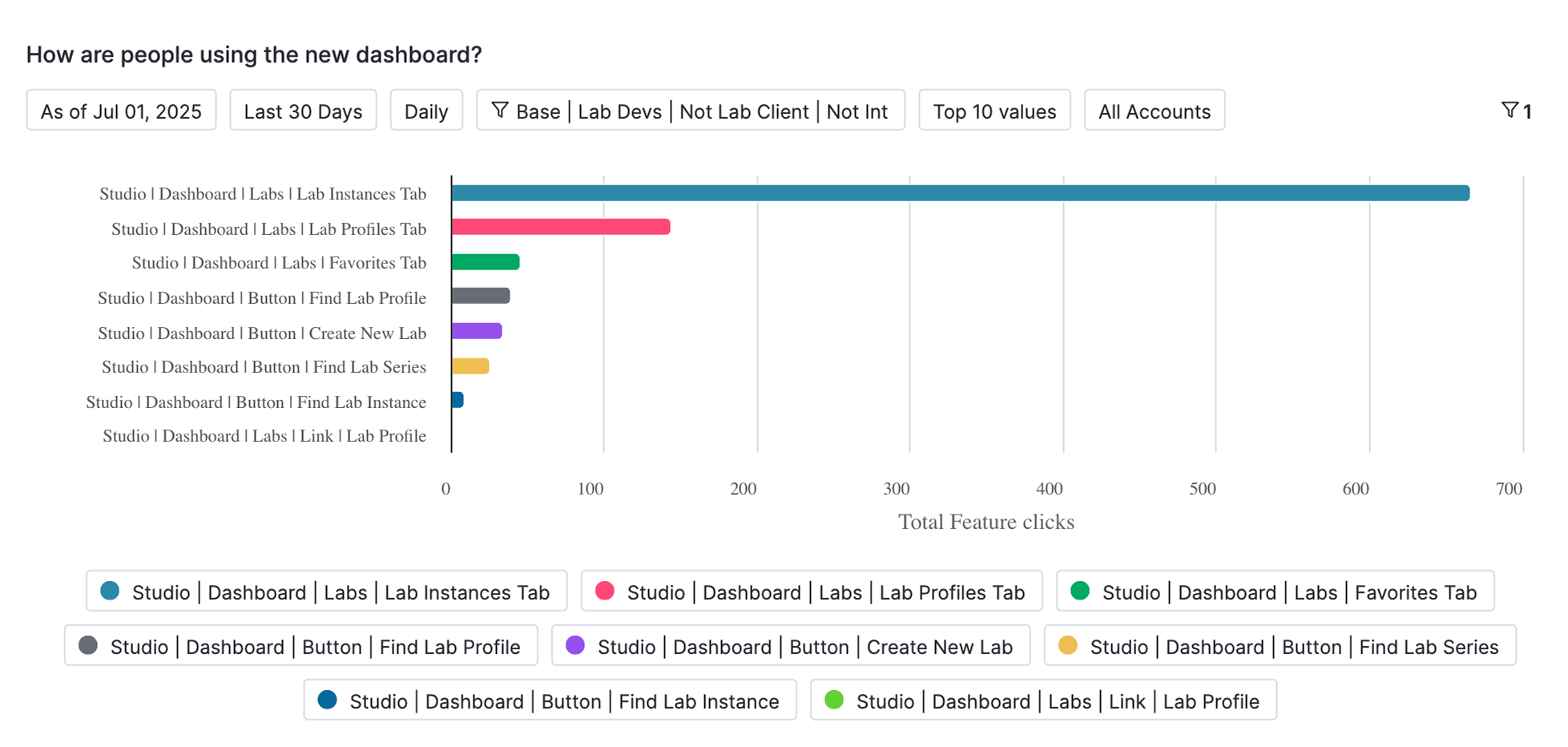
Lab authors' most common action was navigating to a single tab of the home page (lab instances). Pendo paths revealed that—of the users who didn't immediately leave the home page—most only leveraged it for an unintended flow.
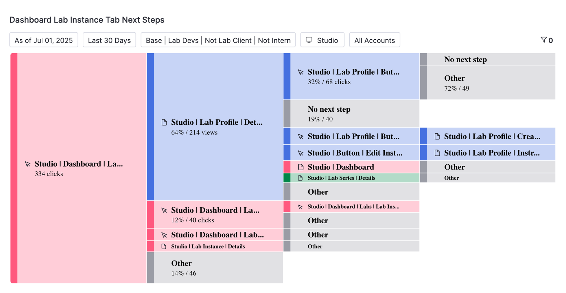
These insights, combined with qualitative feedback from users, highlighted confusion, friction, and a desire for a more action-oriented experience.
Design Approach
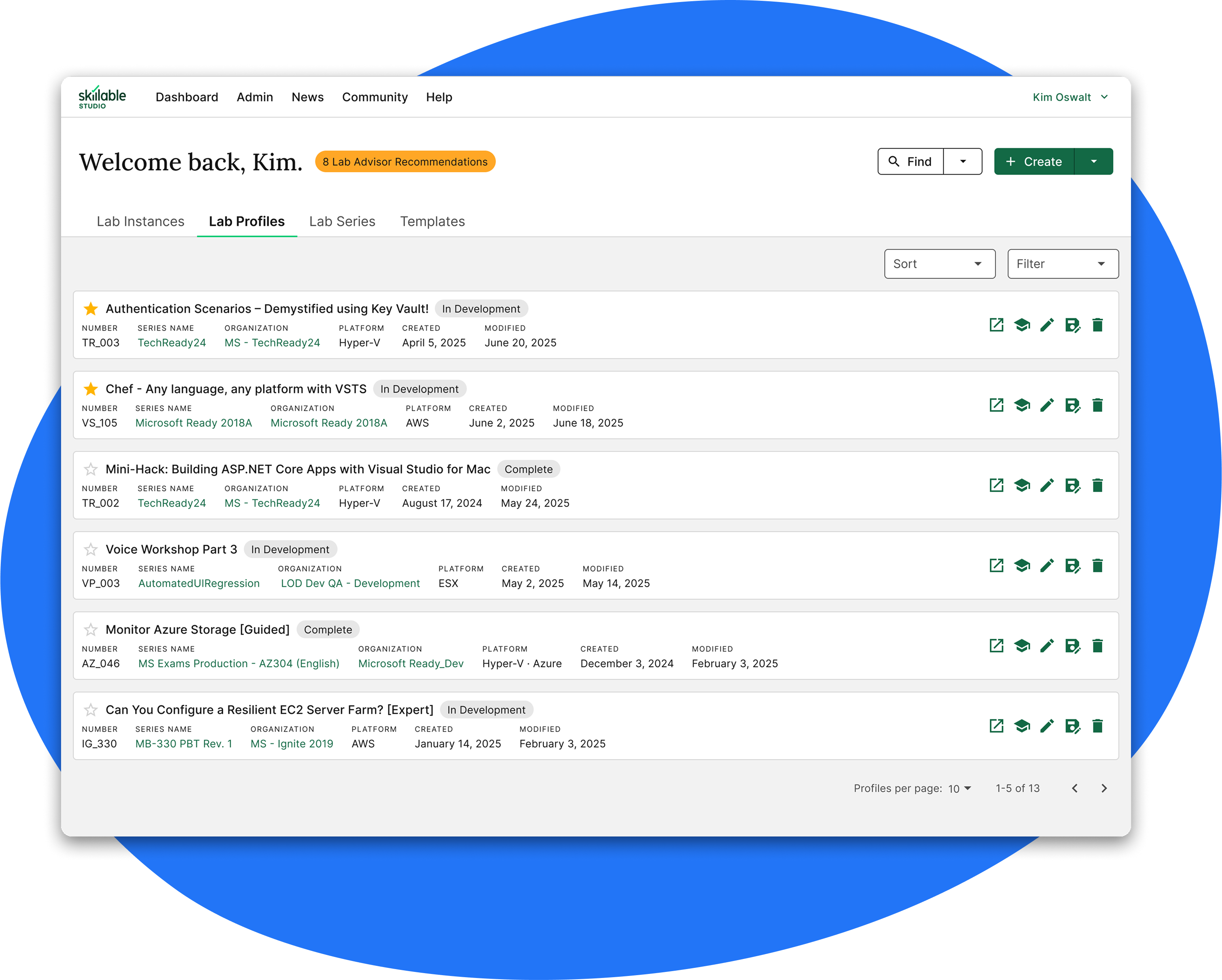
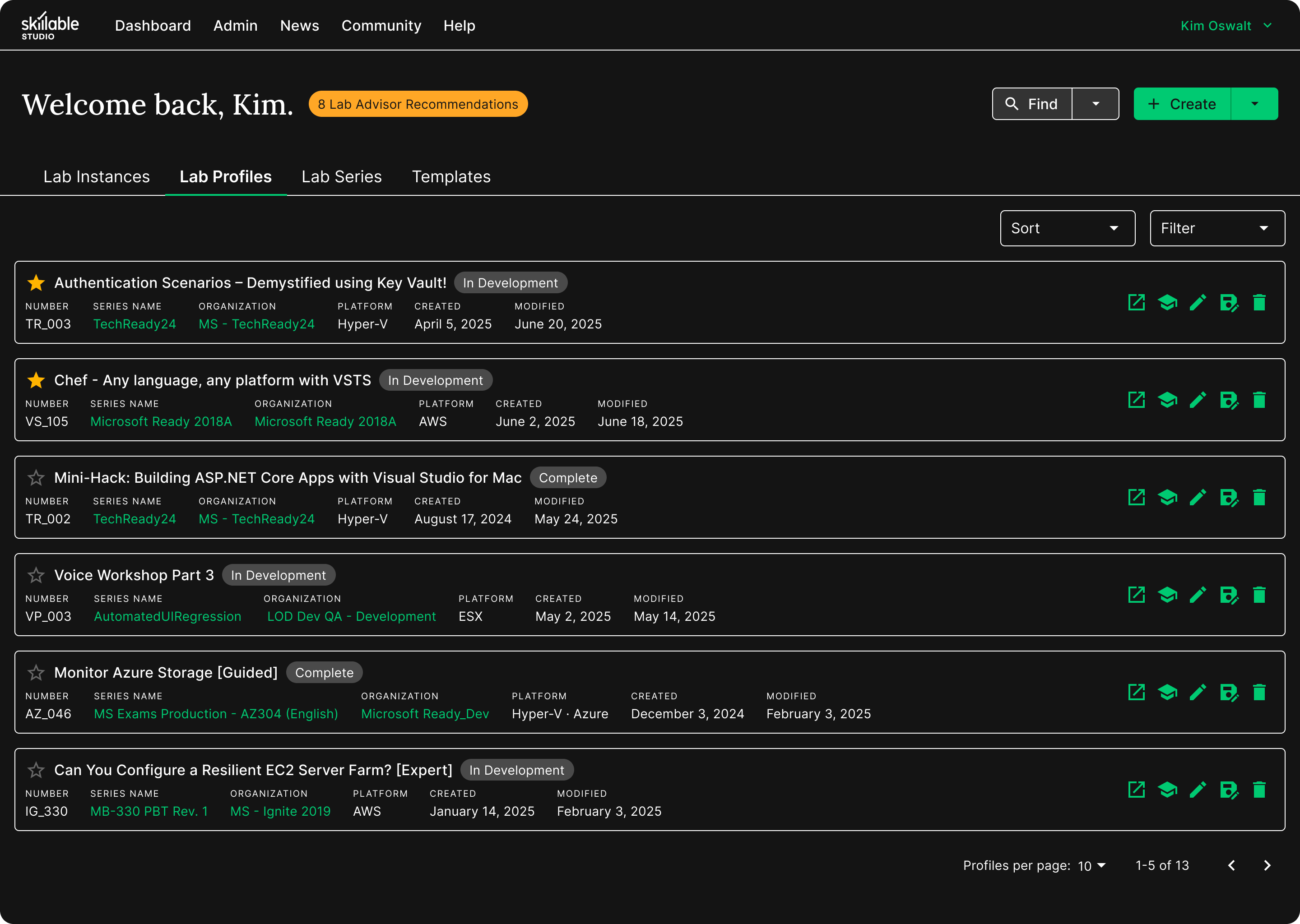
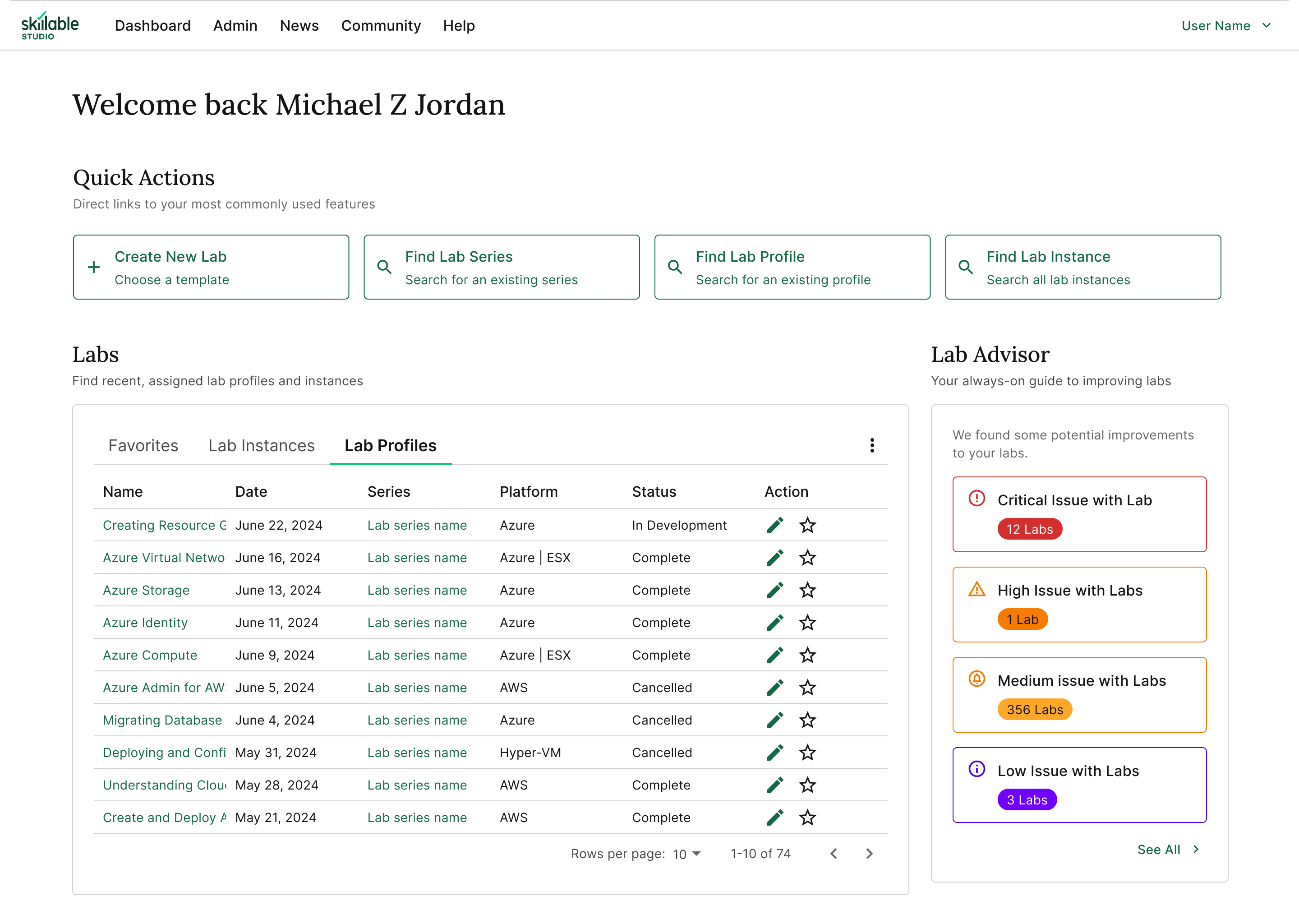
The goal of this project was to make better use of screen real estate on the home page—removing unused content, surfacing the most important actions, reducing clicks, streamlining workflows, and helping users feel more in control from the moment they log in.
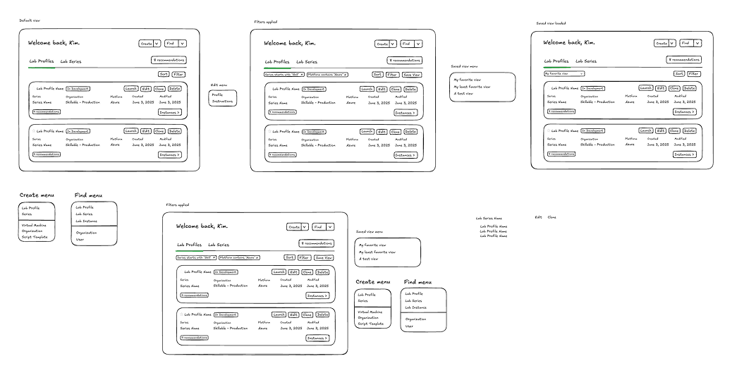
Wireframe sketches of the redesigned home page
I focused on making the home page feature-rich and action-oriented, laying the foundation for deeper customization in the future.
Key improvements included:
- Replaced Lab Advisor sidebar (<10% usage) with simple button to declutter the interface
- Consolidated four large, underused "quick actions" into two core "find" and "create" split buttons
- Introduced new tabs with integrated favoriting to enable access to a wider variety of content
- Replaced data table with more modern, responsive card layout
- Added one-click shortcuts to key actions from each card (based on Pendo insights from elsewhere in the platform)
- Implemented filtering and sorting, with saved views on the roadmap
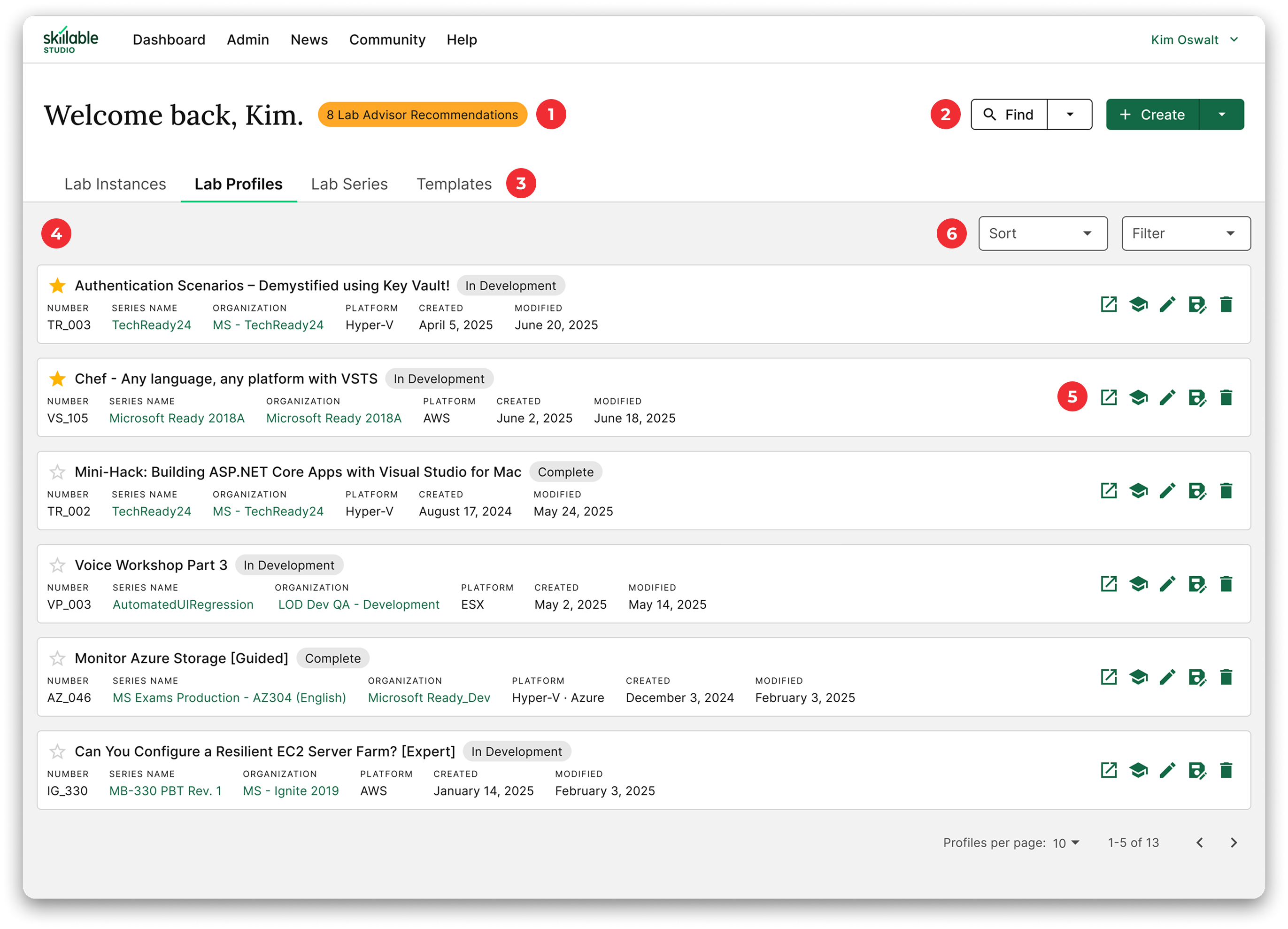
Explore the key changes by clicking the hotspots on the design below.
Prototyping in Code
I built a fully-functional prototype of the user home page in React + Next.js, which enabled faster ideation, more robust interaction design, and a greatly enhanced user testing experience.
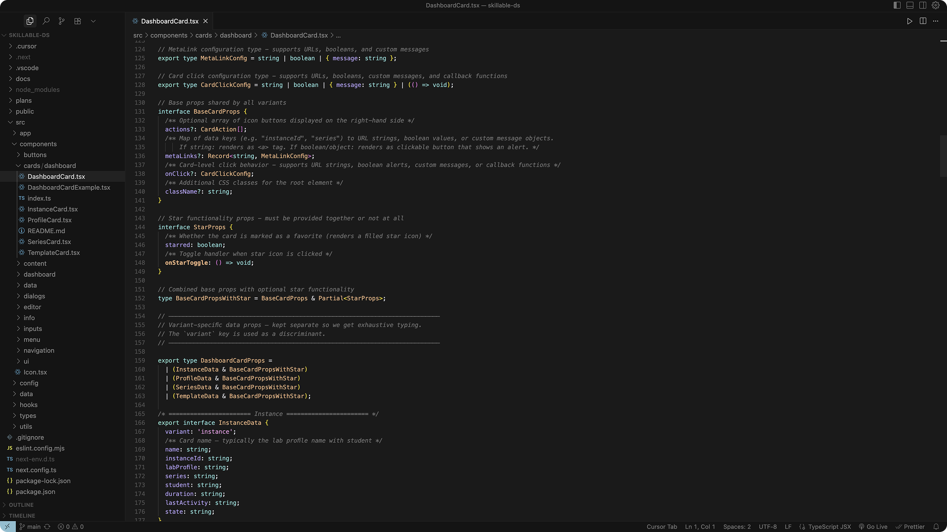
The GitHub repository includes a full component library and prototype development environment I created for Skillable's product team to use in future projects.
Impact
The updated home page gives power users and new users alike a streamlined, modern starting point—making it easier to take action, stay organized, and get more done in less time. By surfacing the most important tools and workflows up front, we're helping users work smarter and build with confidence.