
Redesigning How Schools Build Classes Around Student Needs
Timely Schools
Role: Project lead
Company: Timely Schools (K-12 scheduling software)
At a glance
I led the end-to-end redesign of a core workflow in Timely's secondary scheduling app—how schools translate their course catalog into schedulable sections.
I took it from a tangle of complaints to aligned team goals, a fully-functional prototype, validated designs, full specs, engineering tickets, and a GTM launch kit.
The problem
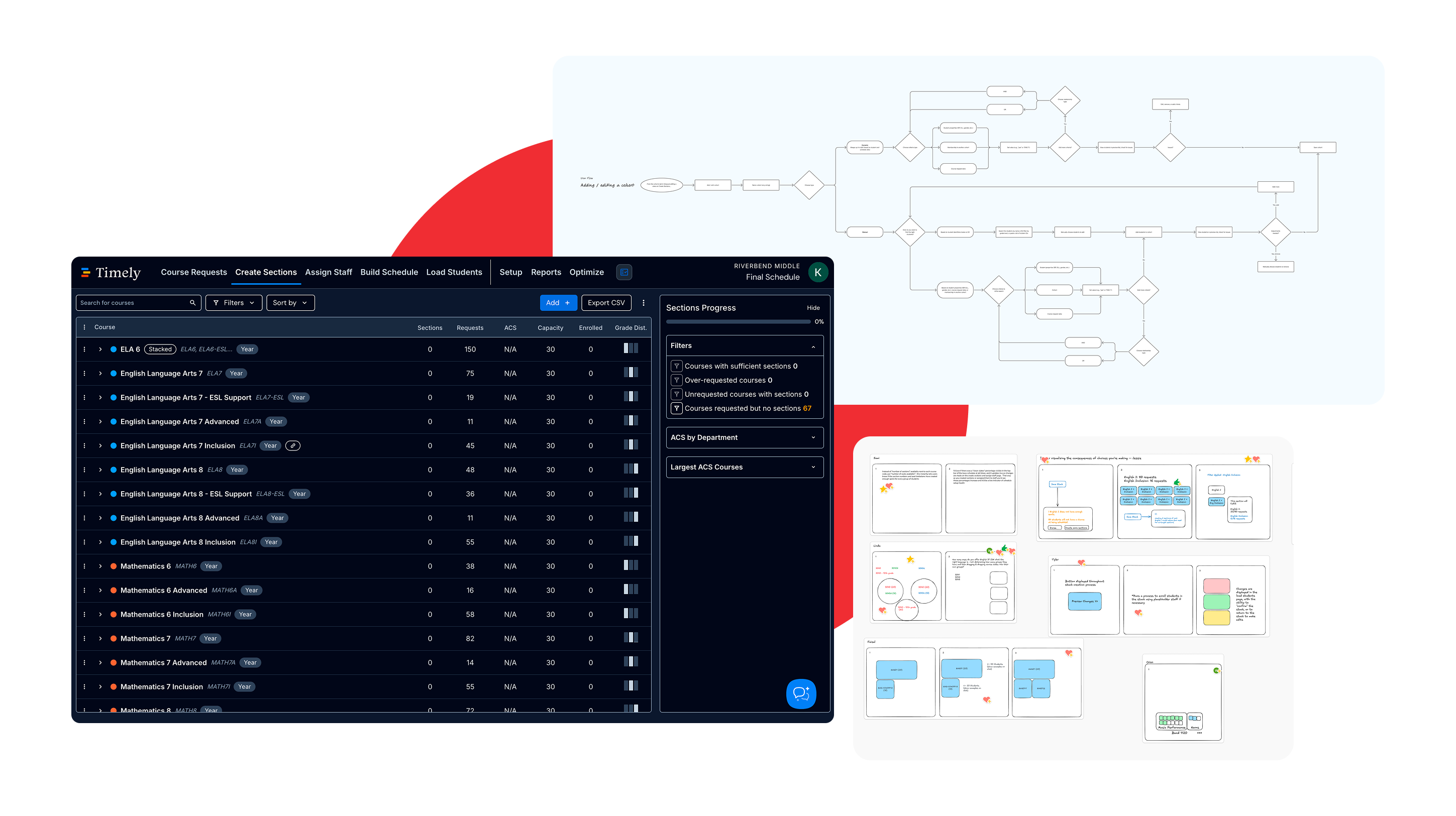
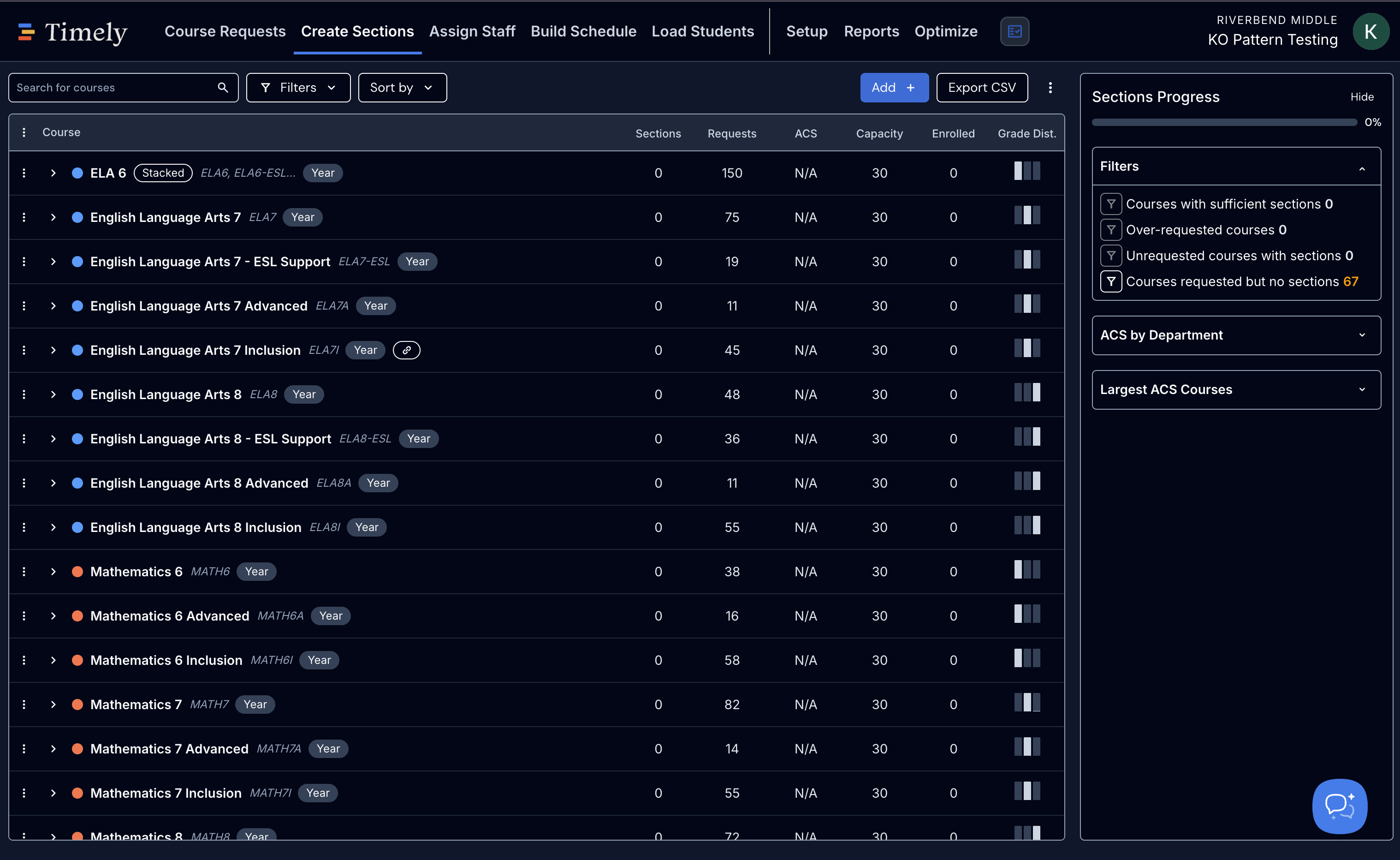
The existing tool functioned, but getting to a working setup was exhausting and required hands-on assistance from the success team. Routing students to the right sections by attribute is one of Timely's key differentiators. Schools valued the outcome (sections ready to meet every student's needs before staff were assigned) but they could rarely get there on their own.
"Flexibility is both a blessing and a curse. The outcomes are often really successful, but the path to get there stinks."—Success manager
A few things made it hard.
The result was heavy cognitive load, drop-off risk, and a reliance on our success team to hand-hold schools through setup.
→ A mismatched mental model
Users had a clear goal but had to translate it through convoluted, often hidden settings that used dense, inconsistent terminology.
→ No finish line
Schedulers received no feedback throughout the process, so they were forced to guess when they were done and whether or not they'd set up their classes correctly.
→ No smart defaults
Users had to manually create section types and capacity limits the system could have inferred.
→ Hidden consequences
Clickable things didn't look clickable, and choices that looked cosmetic carried real meaning.
→ Workarounds
Schedulers had been forced to learn complex workarounds to hack together solutions that met their needs.
I owned this project from problem framing through launch readiness, working across product, design, and engineering.
Project leadership
Set direction, facilitated alignment across squads, and worked hand-in-hand with engineering on scoping decisions.
Product requirements
Defined jobs to be done, named what we had to preserve, and flagged data-model and cross-squad risks early.
Design
Built the conceptual model, flows, prototypes, Figma designs, and a full content design spec.
AI-native building
Used Claude to build working prototypes, mine customer research, write acceptance criteria, and generate tickets for engineering.
I started by ensuring all stakeholders understood and agreed on the core problem to solve. This workflow touched several squads and a brittle data model, so shared understanding was a prerequisite.
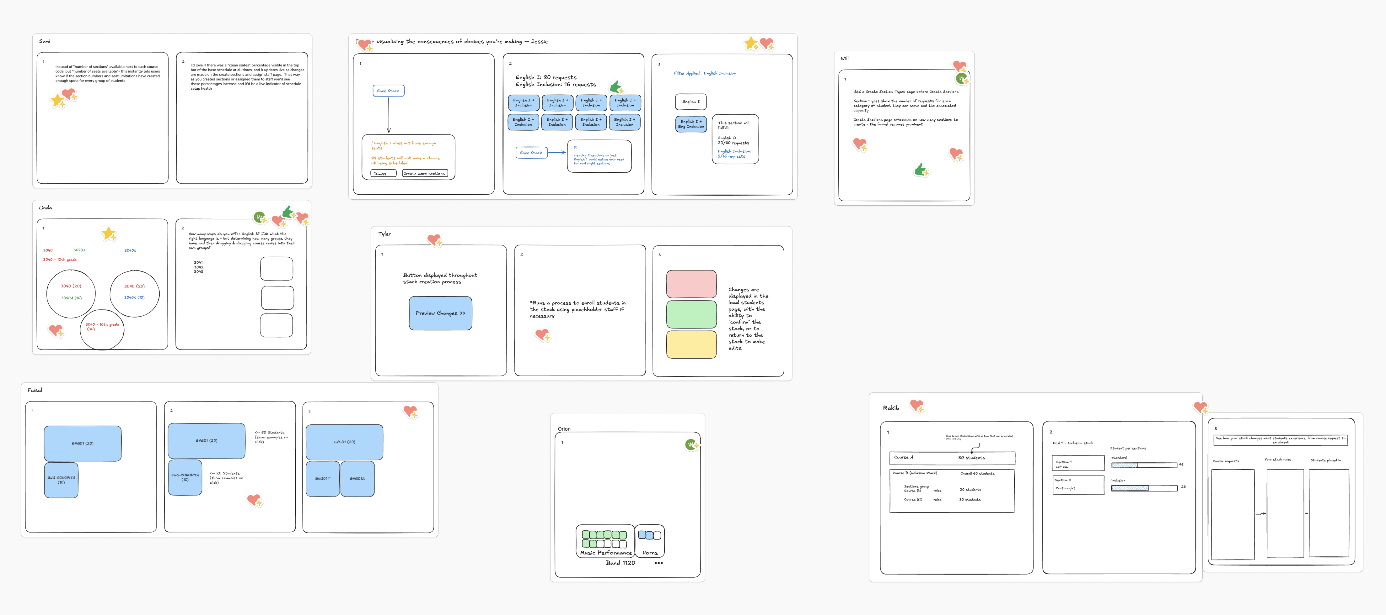
Crazy 8s sketches from the 90-minute “How might we” session.
- Mapped the current state. I documented the full flow with screenshots and researched real use cases with our SMEs, including the hacks and workarounds schools relied on.
- Ran a pain points workshop. I facilitated a session to surface where the experience broke down, then synthesized it into six themes the team could rally around.
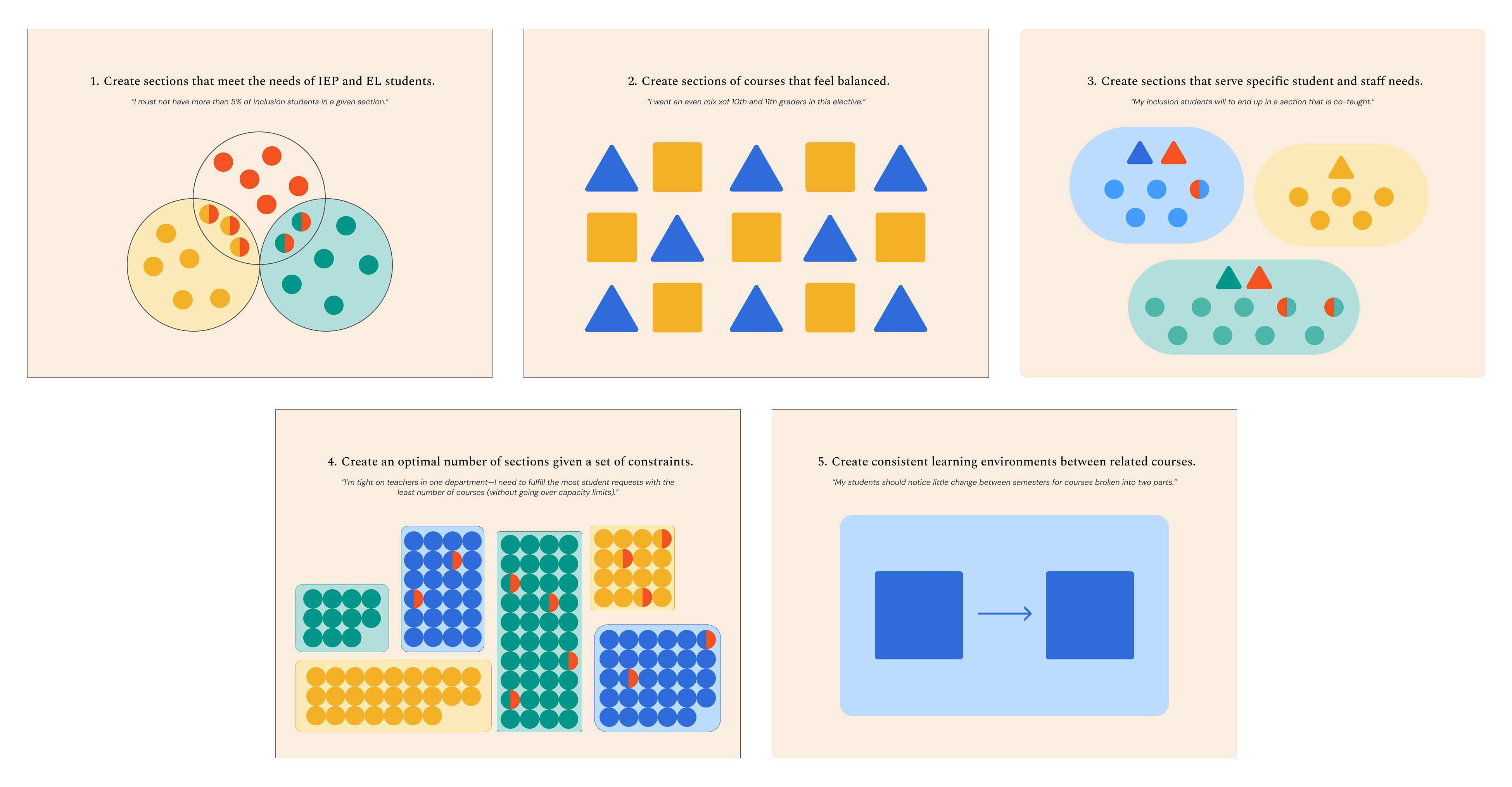
- Defined the jobs-to-be-done. In partnership with PM, I established five core jobs to be done and created graphics to make them easy to reference.
-
Ran a "How might we" workshop.
I turned the core usability problems into three HMW questions and led a 90-minute session with nine people from product, engineering and success. The group voted on three directions to explore.
- Understanding consequences—previewing the effect of changes as they happen.
- Separation of concerns—defining types of classes separately from the rules that route students into them.
- Guided process—giving users clear steps and a sense of progress.
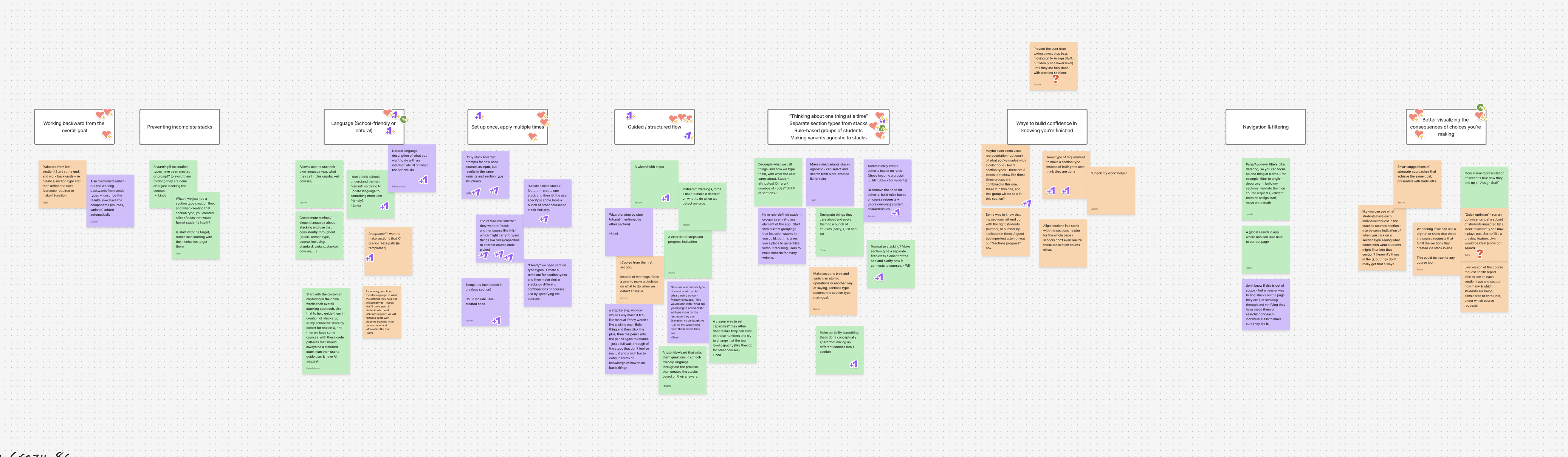
Ideas clustered into themes, then voted on to pick the three directions to explore.
Just as important, we agreed on what not to lose—attribute-based routing, the simplicity of auto-created section types, sections that are ready before staffing, and the ability to check which students land where. That list became a guardrail for every design decision.
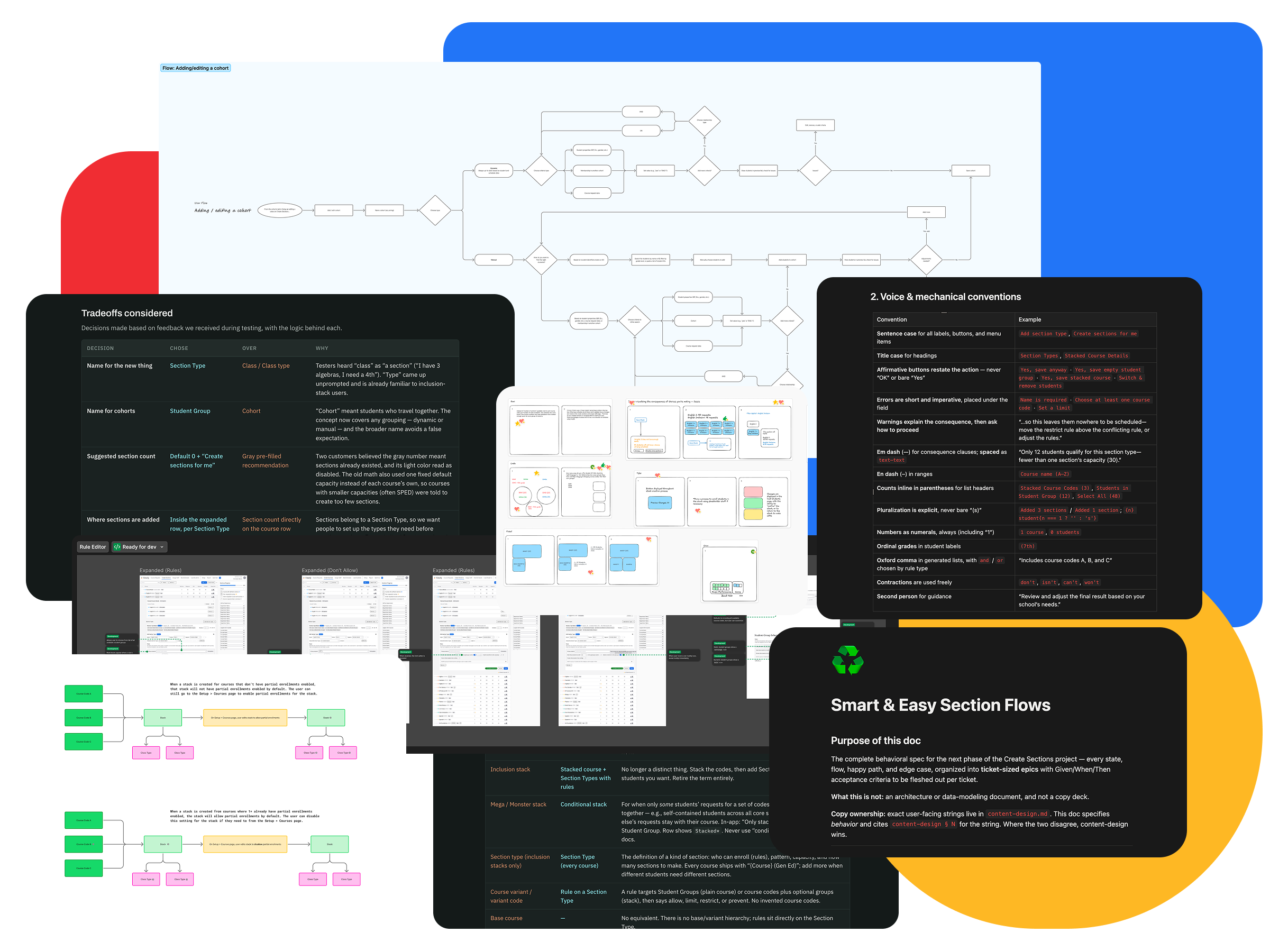
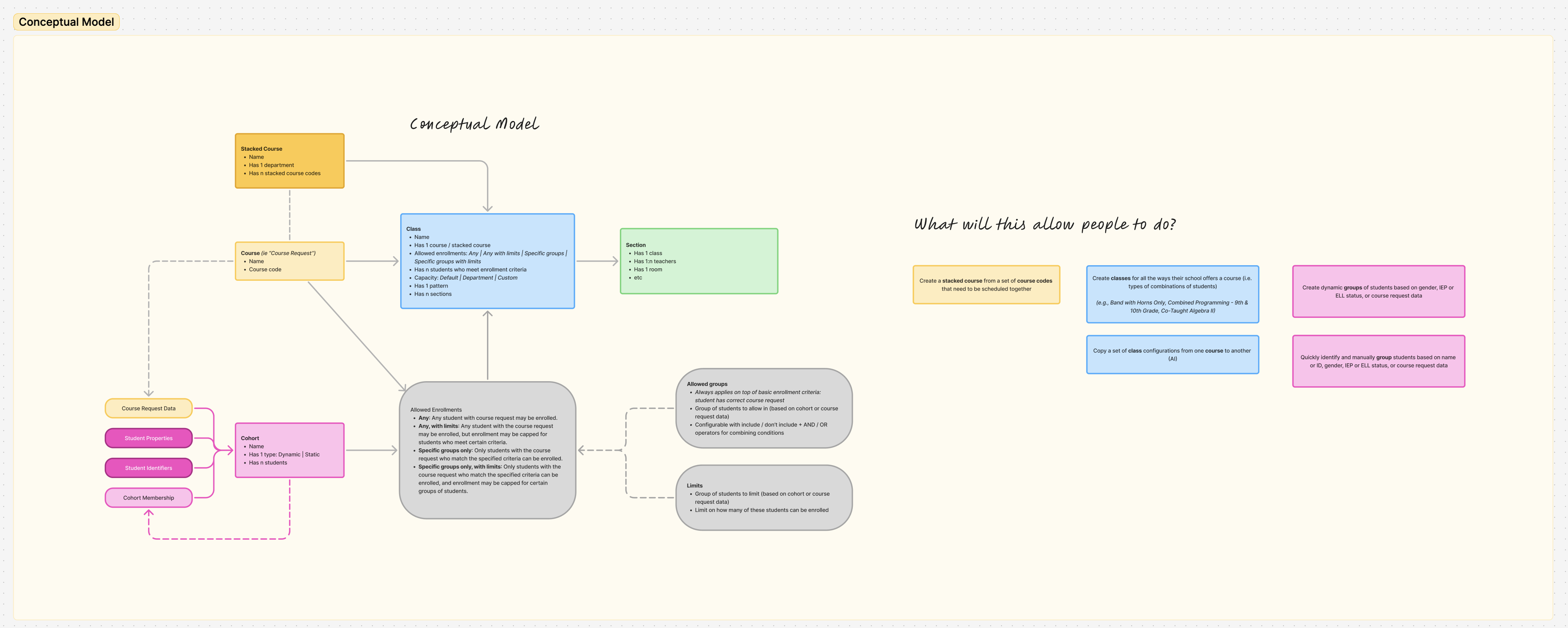
I started by defining a new conceptual model. A pile of sticky notes and a rough object map became FigJam diagrams that I used to facilitate early conversations with engineering leads. From there, I fleshed out workflow diagrams and started exploring design concepts, sharing early rough work daily with the team for fast feedback.
Static screens couldn't come close to demonstrating how this flow would feel, so I moved quickly to building a functional prototype based on the early sketches and explorations. I wrote a spec for a standalone prototype and built it with Claude Code, eventually creating multiple branches to explore and iterate on different approaches during testing.
Testing & iteration
I used the prototype to run 11 usability testing sessions with users and customer-facing scheduling experts.
After each session, I recorded learnings, noted open questions, and shipped changes to the prototype. For every new version of the prototype, I shared updates and questions with the project's tech lead, allowing us to collaborate closely throughout the entire design process.
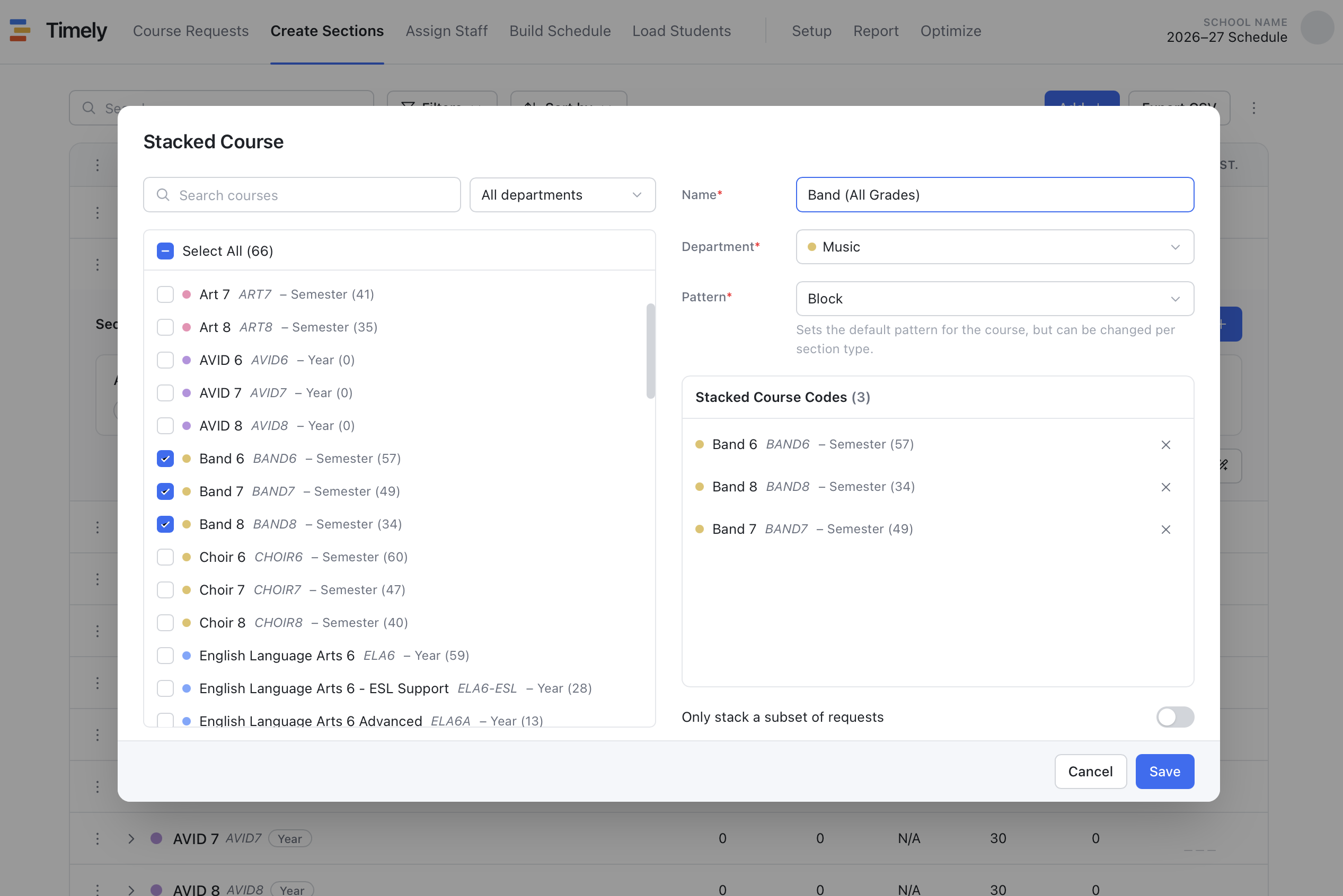
By the time we reached the delivery phase, my main goals were ensuring engineering had all the artifacts they needed to move quickly based on decisions we'd already made together and preparing our internal teams with go-to-market and enablement resources.
- Figma designs for every flow and edge case.
- A content design spec with guiding principles and every piece of copy in the experience.
- A flow and acceptance criteria spec, generated with Claude from the finished prototype and every decision made along the way.
- A ticket breakdown I shaped with our tech lead, then used Claude to turn the designs, specs and breakdown into ready-to-work engineering tickets.
- A go-to-market kit with core benefits backed by tester quotes, an old-to-new translation guide, needed help-doc updates, likely customer questions and answers, and a log of key tradeoffs.
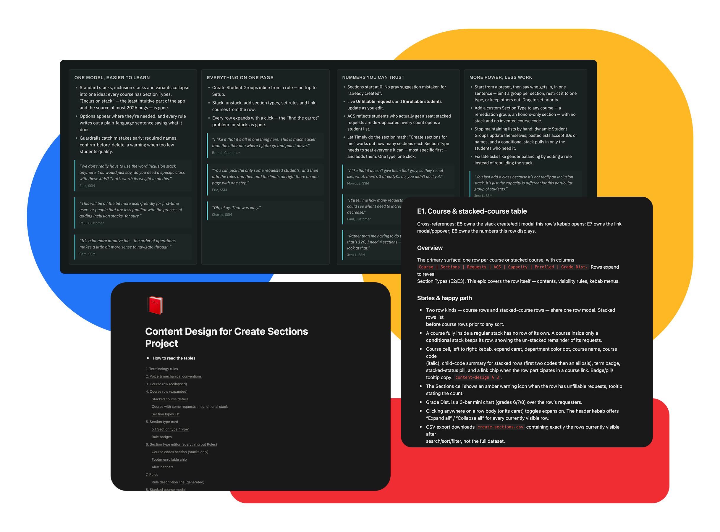
Using AI for the documentation layer kept the specs faithful to the tested prototype, and I spent my time on decisions instead of transcription.
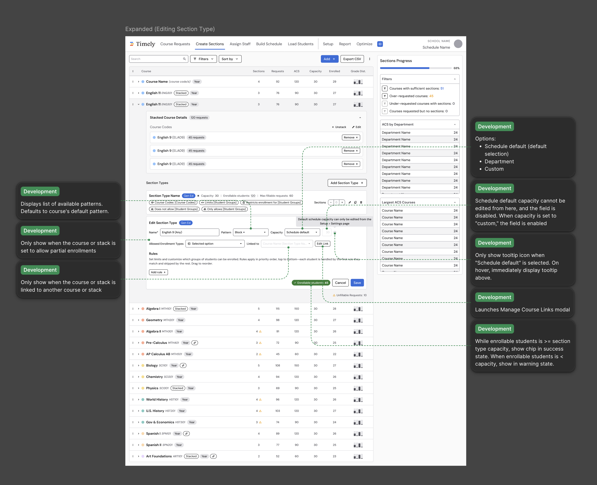
Designs annotated with behavior notes so engineering had the reasoning alongside the pixels.
The redesign is in active development, with the MVP launching October 2026. The specs and tickets gave engineering a clear path, enabling the team to more than double its productivity sprint-over-sprint and cut review cycles from an average of 3.5 to 1.5.
Some early feedback we've already heard from users:
“I just made a cohort using the new modal and it was SO EASY!”
Success manager
“I love how easy that is.”
Assistant principal
“This will be far more user-friendly for first-time users or people that are less familiar with the process of adding [these sections].”
Dean of students
Explore the prototype
Walk through the redesigned flow yourself—the same prototype I used to run usability tests and align the team.